Androidアプリケーションのレイアウト作成
今回はAndroidのUI開発の最新ツール「Jetpack Compose」を使用してAndroidアプリケーションのレイアウトを作成してみました。 従来のXMLを用いたUI開発とは全く異なり、簡潔で分かりやすく直感的に開発できるので個人的には非常に好印象でした。 現時点では、まだ実験的な位置づけのようですが、今後の主流になるのは間違いなさそうな感じがします。
今回の開発環境は「Android Studio Flamingo | 2022.2.1 Patch 2」を使用しました。 エミュレータの仮想デバイスは「10.1 WXGA(Tablet) API 30」で基本的には横向きで使用する前提にしています。 「Jetpack Compose」を利用するのは初めてで、あれこれ調べながら作成しましたが、理解が追いつかず、いろいろおかしい箇所もあるかと思います。 もし流用される場合は、適宜修正してください。ご利用は自己責任でお願いいたします。
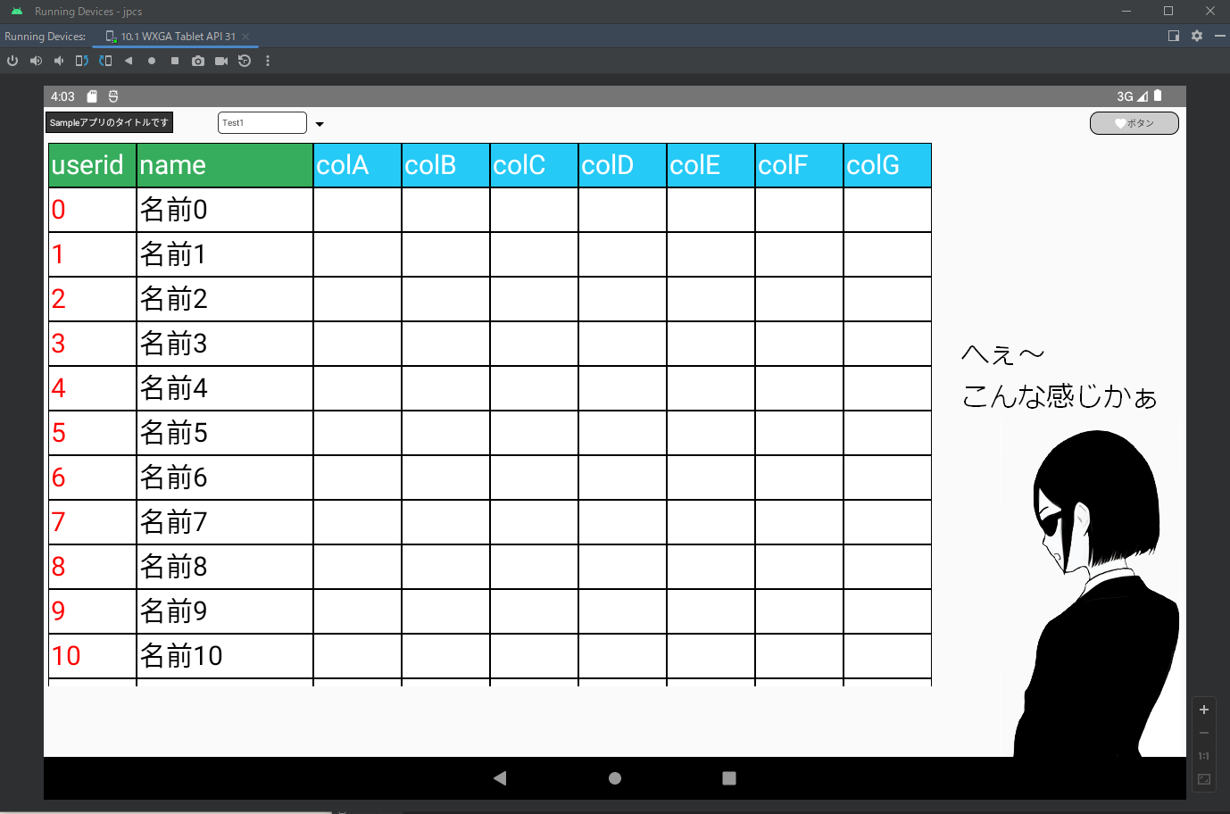
完成イメージ
ソースは以下のとおりです。新規プロジェクト作成で「Empty Activity」テンプレートを選択した際に自動作成された「MainActivity.kt」を修正しました。 新規プロジェクト作成に関してはコチラの記事を参考にしてください。【はじめてのAndroidアプリケーション(Kotlin)】
package com.sample.jpcs

import android.os.Bundle
import android.util.Log
import android.widget.Toast
import androidx.activity.ComponentActivity
import androidx.activity.compose.setContent
import androidx.compose.foundation.background
import androidx.compose.foundation.border
import androidx.compose.foundation.layout.Box
import androidx.compose.foundation.layout.Column
import androidx.compose.foundation.layout.PaddingValues
import androidx.compose.foundation.layout.Row
import androidx.compose.foundation.layout.RowScope
import androidx.compose.foundation.layout.fillMaxHeight
import androidx.compose.foundation.layout.fillMaxSize
import androidx.compose.foundation.layout.fillMaxWidth
import androidx.compose.foundation.layout.height
import androidx.compose.foundation.layout.offset
import androidx.compose.foundation.layout.padding
import androidx.compose.foundation.layout.size
import androidx.compose.foundation.layout.width
import androidx.compose.foundation.rememberScrollState
import androidx.compose.foundation.shape.RoundedCornerShape
import androidx.compose.foundation.verticalScroll
import androidx.compose.material.icons.Icons
import androidx.compose.material.icons.filled.Favorite
import androidx.compose.material3.Button
import androidx.compose.material3.ButtonDefaults
import androidx.compose.material3.DropdownMenu
import androidx.compose.material3.DropdownMenuItem
import androidx.compose.material3.Icon
import androidx.compose.material3.Text
import androidx.compose.runtime.Composable
import androidx.compose.ui.Alignment
import androidx.compose.ui.Modifier
import androidx.compose.ui.graphics.Color
import androidx.compose.ui.tooling.preview.Preview
import androidx.compose.ui.unit.dp
import androidx.compose.ui.unit.sp
import com.sample.jpcs.ui.theme.JpcsTheme
import androidx.compose.foundation.layout.*
import androidx.compose.material.icons.filled.ArrowDropDown
import androidx.compose.material3.IconButton
import androidx.compose.runtime.getValue
import androidx.compose.runtime.mutableStateOf
import androidx.compose.runtime.remember
import androidx.compose.runtime.setValue
import androidx.compose.ui.platform.LocalContext

class MainActivity : ComponentActivity() {
    override fun onCreate(savedInstanceState: Bundle?) {
        super.onCreate(savedInstanceState)
        setContent {
            Sample()
        }
    }
}

/*
 * 全体のレイアウト
 */
@Composable
fun Sample() {
    //全体
    Box(Modifier.fillMaxSize()) {
        //1行目
        Row(
            modifier = Modifier.offset(2.dp, 5.dp)    //位置
        ) {
            //タイトル
            Text(
                text = "Sampleアプリのタイトルです",  //テキスト
                color = Color(0xffffffff),            //文字の色
                fontSize = 10.sp,                     //文字サイズ
                modifier = Modifier
                    .offset(0.dp, 0.dp)                        //位置
                    .background(color = Color(0xff333333))     //背景色
                    .border(1.dp, Color(0xff000000))           //線
                    .padding(5.dp)                             //余白
            )
            //プルダウン用のエリア
            Column(
                horizontalAlignment  = Alignment.Start, //左寄せ
                modifier = Modifier
                    .padding(50.dp,0.dp,0.dp,0.dp)      //余白
            ){
                SelectBox()                             //プルダウン
            }
            //ボタン用のエリア
            Column(
                horizontalAlignment  = Alignment.End,   //右寄せ
                modifier = Modifier
                    .fillMaxWidth()                     //最大幅
                    .padding(0.dp,0.dp,10.dp,0.dp)      //余白
            ){
                //ボタン
                Button(
                    onClick = {                             //クリックされた時
                        Log.d("Button", "onClick")          //ログ
                    },
                    shape = RoundedCornerShape(10.dp),      //角を丸める
                    contentPadding = PaddingValues(top = 0.dp, start = 0.dp, end = 0.dp, bottom = 0.dp),    //余白
                    modifier = Modifier
                        .border(1.dp, Color(0xff000000), RoundedCornerShape(10.dp))           //線
                        .width(100.dp)                                                        //幅
                        .height(26.dp),                                                       //高さ
                    colors = ButtonDefaults.buttonColors(containerColor = Color(0xffcccccc))  //ボタンの色
                ) {
                    //ボタンのアイコン
                    Icon(
                        imageVector = Icons.Filled.Favorite,    //アイコンのイメージ
                        contentDescription = null,              //説明
                        modifier = Modifier.size(15.dp)         //サイズ
                    )
                    //ボタンのテキスト
                    Text(
                        text ="ボタン",                     //表示テキスト
                        color = Color(0xff333333),          //文字の色
                        fontSize = 10.sp                    //文字のサイズ
                    )
                }
            }
        }
        //2行目
        Row {
            //グリッド
            TableGrid()
        }
    }
}

/*
 * グリッドのレイアウト
 */
@Composable
fun TableGrid() {
    //全体
    Box(
        modifier = Modifier
            .width(1000.dp)                //幅
            .fillMaxHeight(0.85f)          //高さ85%
            .offset(0.dp, 35.dp)           //位置
    ) {
        //サンプルデータを保持するクラスの定義
        data class Sample(val id: Int,
                          val name: String,
                          val colA: String,
                          val colB: String,
                          val colC: String,
                          val colD: String,
                          val colE: String,
                          val colF: String,
                          val colG: String
        )
        //サンプルデータを格納する配列
        val sampleList:MutableList<Sample> = mutableListOf()
        //100回ループしてテストデータを作成
        for(i in 0..99) {
            //配列にサンプルデータを格納
            sampleList.add(Sample(i, "名前$i", "", "", "", "", "", "", ""))
        }
        //1列目の幅
        val col01Width = .1f // 10%
        //2列目の幅
        val col02Width = .2f // 20%
        //3列目の幅
        val col03Width = .1f // 10%
        //4列目の幅
        val col04Width = .1f // 10%
        //5列目の幅
        val col05Width = .1f // 10%
        //6列目の幅
        val col06Width = .1f // 10%
        //7列目の幅
        val col07Width = .1f // 10%
        //8列目の幅
        val col08Width = .1f // 10%
        //9列目の幅
        val col09Width = .1f // 10%

        //縦
        Column(
            modifier = Modifier
                .padding(5.dp)                          //余白
                .verticalScroll(rememberScrollState())  //縦方向にスクロールできるようにする
        ) {
            //ヘッダー行
            Row(
                modifier = Modifier
                    .offset(0.dp, 0.dp)                 //位置
            ) {
                RowComponent(text = "userid", weight = col01Width, Color(0xff36ad5c), Color.White)     //1列目
                RowComponent(text = "name", weight = col02Width, Color(0xff36ad5c), Color.White)       //2列目
                RowComponent(text = "colA", weight = col03Width, Color(0xff25caf7), Color.White)       //3列目
                RowComponent(text = "colB", weight = col04Width, Color(0xff25caf7), Color.White)       //4列目
                RowComponent(text = "colC", weight = col05Width, Color(0xff25caf7), Color.White)       //5列目
                RowComponent(text = "colD", weight = col06Width, Color(0xff25caf7), Color.White)       //6列目
                RowComponent(text = "colE", weight = col07Width, Color(0xff25caf7), Color.White)       //7列目
                RowComponent(text = "colF", weight = col08Width, Color(0xff25caf7), Color.White)       //8列目
                RowComponent(text = "colG", weight = col09Width, Color(0xff25caf7), Color.White)       //9列目
            }

            //サンプルデータを格納した配列の件数分ループする
            for(item in sampleList) {
                //明細行
                Row(
                    modifier = Modifier.offset(0.dp, 0.dp)  //位置
                ) {
                    RowComponent(text = item.id.toString(), weight = col01Width, Color.White, Color.Red)   //1列目
                    RowComponent(text = item.name, weight = col02Width, Color.White, Color.Black)          //2列目
                    RowComponent(text = item.colA, weight = col03Width, Color.White, Color.Blue)           //3列目
                    RowComponent(text = item.colB, weight = col04Width, Color.White, Color.Black)          //4列目
                    RowComponent(text = item.colC, weight = col05Width, Color.White, Color.Black)          //5列目
                    RowComponent(text = item.colD, weight = col06Width, Color.White, Color.Black)          //6列目
                    RowComponent(text = item.colE, weight = col07Width, Color.White, Color.Black)          //7列目
                    RowComponent(text = item.colF, weight = col08Width, Color.White, Color.Black)          //8列目
                    RowComponent(text = item.colG, weight = col09Width, Color.White, Color.Black)          //9列目
                }
            }
        }
    }
}

/*
 * グリッド行のレイアウト
 */
@Composable
fun RowScope.RowComponent(
    text: String,   //引数1: テキスト
    weight: Float,  //比率
    bgColor: Color, //背景色
    color: Color    //テキストの色
) {
    //テキスト
    Text(
        text = text,        //テキスト
        Modifier
            .height(50.dp)              //高さ
            .background(bgColor)        //背景色
            .border(1.dp, Color.Black)  //線
            .weight(weight)             //比率
            .padding(3.dp),             //余白
        fontSize = 30.sp,               //文字のサイズ
        color = color                   //テキストの色
    )
}

/*
 * プルダウンのレイアウト
 */
@Composable
fun SelectBox() {
    //context
    val context = LocalContext.current
    //状態(rememberで保存された値は、他のコンポーザブルのパラメータとして使用できる)
    var expanded by remember { mutableStateOf(false) }
    //プルダウンに表示するデータのリスト
    val optionList = arrayOf("Test1", "Test2", "Test3", "Test4", "Test5")
    //選択値
    var selectedText by remember { mutableStateOf(optionList[0]) }
    //全体
    Box(
        modifier = Modifier.wrapContentSize(Alignment.TopStart) //左寄せ
    ) {
        //テキスト
        Text(
            text = selectedText,             //テキストには選択値をセット
            color = Color(0xff333333),       //文字の色
            fontSize = 10.sp,                //文字のサイズ
            modifier = Modifier
                .width(100.dp)               //幅
                .height(25.dp)               //高さ
                .offset(0.dp, 0.dp)          //位置
                .background(color = Color(0xffffffff),shape = RoundedCornerShape(5.dp)) //背景色と角を丸める
                .border(1.dp, Color(0xff333333),shape = RoundedCornerShape(5.dp))       //線の色と角を丸める
                .padding(5.dp)               //余白
        )
        //アイコンボタン
        IconButton(
            onClick = { expanded = !expanded }, //クリックした時(状態を切り替える)
            modifier = Modifier
                .padding(0.dp,0.dp)             //余白
                .height(25.dp)                  //高さ
                .absoluteOffset(90.dp, 0.dp)    //位置
        ) {
            //アイコン
            Icon(
                imageVector = Icons.Default.ArrowDropDown,   //アイコンイメージ
                contentDescription = "選択"                  //説明
            )
        }
        //プルダウン
        DropdownMenu(
            expanded = expanded,                    //状態
            onDismissRequest = { expanded = false } //範囲外をタップした時のコールバック
        ) {
            //データの件数分ループ
            optionList.forEach { item ->
                //プルダウンの中身
                DropdownMenuItem(
                    text = { Text(text = item) },   //テキスト
                    onClick = {                     //クリックした時
                        selectedText = item         //選択したデータを保持
                        expanded = false            //状態
                        Toast.makeText(context, item, Toast.LENGTH_SHORT).show() //メッセージを表示
                    }
                )
            }
        }
    }
}

/*
 * プレビュー用
 */
@Preview(showBackground = true)
@Composable
fun GreetingPreview() {
    JpcsTheme {
        //全体のレイアウト
        Sample()
    }
}
初めての「Jetpack Compose」でしたが、Kotlinのシンプルさが活かされていて今風な感じだったので、XMLでのUI開発に比べると とっつきやすく抵抗はありませんでした。バージョンアップと共にまだまだ変更が加わっていく可能性が高いので、今後も勉強に励みます!