Chart.jsで背景色を変えるプラグイン
Chart.jsで棒グラフの背景色を変えるプラグイン作成に挑戦してみました!
今回はVue3、Nuxt3、TypeScriptの組み合わせで実装しており、
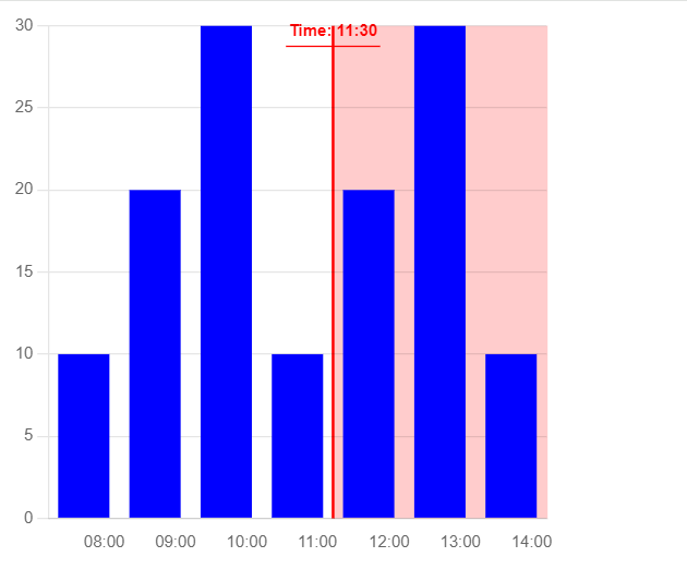
任意で指定したX軸の値を超えると背景色が赤くなります。
components/BarChart.vue
棒グラフを表示するコンポーネントです。
propsでチャートのデータ、オプション設定、幅、高さ、指定したX軸の値を受け取り、チャートに反映しています。
また、後で作成するプラグイン(chart-background-plugin.ts)に関しては
プラグインのインスタンスを作成してチャートに適用しています。
<template>
  <div>
    <canvas :width="width" :height="height" ref="barChart"></canvas>
  </div>
</template>

<script lang="ts" setup>
import { onMounted, ref, defineProps } from 'vue';
import { Chart, BarController, BarElement, CategoryScale, LinearScale, Title, Tooltip } from 'chart.js';
import { useNuxtApp } from '#app';
import { createBackgroundPlugin } from '~/plugins/chart-background-plugin';

// Propsの定義
const props = defineProps<{
  chartData: {
    labels: string[],
    datasets: { label: string, data: number[], backgroundColor: string }[]
  },
  chartOptions: any,
  width: number,
  height: number,
  targetTime: string
}>();

const barChart = ref<HTMLCanvasElement | null>(null);
const { $nuxt } = useNuxtApp();

// プラグインのインスタンスを作成
const backgroundPlugin = createBackgroundPlugin({ targetTime: props.targetTime });

// Chart.jsのコンポーネントを明示的に登録
Chart.register(BarController, BarElement, CategoryScale, LinearScale, Title, Tooltip);

const renderChart = () => {
  if (!barChart.value) return;

  const ctx = barChart.value.getContext('2d');
  if (!ctx) return;

  new Chart(ctx, {
    type: 'bar',
    data: props.chartData,
    options: props.chartOptions,
    plugins: [backgroundPlugin],
  });
};

onMounted(() => {
  renderChart();
});
</script>

<style scoped>
canvas {
  max-width: 100%;
}
</style>
plugins/chart-background-plugin.ts
指定した時刻の位置を計算しています。また、その位置に境界線とラベルを表示し、
この位置を超えるデータの背景色を変更しています。
// plugins/chart-background-plugin.ts

interface BackgroundPluginOptions {
    targetTime: string; // 'HH:MM' 形式で指定
  }

  export const createBackgroundPlugin = (options: BackgroundPluginOptions) => ({
    id: 'backgroundPlugin',
    beforeDraw: (chart: any) => {
      const ctx = chart.ctx;
      const xScale = chart.scales.x;
      const yScale = chart.scales.y;
      const { targetTime } = options;

      const labels = chart.data.labels as string[];
      const startLabel = labels[0];
      const endLabel = labels[labels.length - 1];

      const startTime = startLabel.split(':').map(Number);
      const endTime = endLabel.split(':').map(Number);
      const targetTimeParts = targetTime.split(':').map(Number);

      const startMinutes = startTime[0] * 60 + startTime[1];
      const endMinutes = endTime[0] * 60 + endTime[1];
      const targetMinutes = targetTimeParts[0] * 60 + targetTimeParts[1];

      const startPosition = xScale.getPixelForValue(startLabel);
      const endPosition = xScale.getPixelForValue(endLabel);
      const position = startPosition + ((targetMinutes - startMinutes) / (endMinutes - startMinutes)) * (endPosition - startPosition);
      const yAxisLblWidth = 28; //Y軸ラベルの幅

      // 背景色を塗りつぶす
      ctx.save();
      ctx.fillStyle = 'rgba(255, 0, 0, 0.2)';
      ctx.fillRect(position, yScale.top, xScale.width - position + yAxisLblWidth, yScale.bottom - yScale.top);
      ctx.restore();

      // 縦線を描画
      ctx.save();
      ctx.strokeStyle = 'red';
      ctx.lineWidth = 2;
      ctx.beginPath();
      ctx.moveTo(position, yScale.top);
      ctx.lineTo(position, yScale.bottom);
      ctx.stroke();
      ctx.restore();

      // ラベルを上に表示
      ctx.save();
      ctx.fillStyle = 'red';
      ctx.font = 'bold 12px Arial';
      ctx.textAlign = 'center'; // 中央揃え
      ctx.textBaseline = 'bottom'; // 下揃え

      const text = `Time: ${targetTime}`;
      const xPosition = position;

      // テキストの幅を測定
      const textWidth = ctx.measureText(text).width;
      const yPosition = yScale.top + 10; // 上部に表示

      // ラベルを表示
      ctx.fillText(text, xPosition, yPosition);

      // 縦線の上にラベルの線を描画
      ctx.beginPath();
      ctx.moveTo(xPosition - textWidth / 2 - 2, yPosition + 5);
      ctx.lineTo(xPosition + textWidth / 2 + 2, yPosition + 5);
      ctx.strokeStyle = 'red';
      ctx.stroke();

      ctx.restore();
    },
  });


export default defineNuxtPlugin(() => {
  return {
    provide: {
      chartBackgroundPlugin: createBackgroundPlugin
    }
  }
});
data/chartData.ts
チャートのサンプルデータを設定しているファイルです。
import { reactive } from 'vue';

export const chartData = reactive({
  labels: ['08:00', '09:00', '10:00', '11:00', '12:00', '13:00', '14:00'],
  datasets: [
    {
      label: 'Sample Data',
      data: [10, 20, 30, 10, 20, 30, 10],
      backgroundColor: 'blue',
    },
  ],
});
data/chartOptions.ts
チャートのオプション設定を定義しているファイルです。
import { reactive } from 'vue';

export const chartOptions = reactive({
  responsive: false,
  scales: {
    x: {
      position: 'bottom', // x軸を下部に配置
      ticks: {
        align: 'start', // ラベルを左寄せ
      },
      grid: {
        display: false, // グリッド線を非表示
      },
      offset: true, // x軸ラベルのオフセット
    },
    y: {
      beginAtZero: true,
      grid: {
        drawBorder: false, // y軸のボーダー線を非表示
      },
    },
  },
  plugins: {
    legend: {
      display: true,
    },
    tooltip: {
      callbacks: {
        label: (tooltipItem: any) => `Value: ${tooltipItem.raw}`,
      },
    },
  },
});
pages/Chart2.vue
上記で作成したBarChart.vue、chartData.ts、chartOptions.tsをインポートしています。
<template>
  <BarChart
    :chartData="chartData"
    :chartOptions="chartOptions"
    :width="400"
    :height="400"
    targetTime="11:30"
  />
</template>

<script lang="ts" setup>
import { chartData } from '~/data/chartData';
import { chartOptions } from '~/data/chartOptions';
import BarChart from '~/components/BarChart.vue';
</script>
以下が実行結果です。境界線を超えたデータの背景色が変わっています!
Vue.jsでChart.jsのプラグインを作成する方法の情報が少ないので挑戦してみましたが、理解できたでしょうか?

よく分からなかった人は公式ページを見て何ができるのかを調べてみましょう。 Chart.jsはバージョンの違いなどでネットの記事通りにいかに事があります。 検索エンジンで調査する時は記事で紹介されているChart.jsのバージョンがあっているか確認するようにしましょう。